-
Notifications
You must be signed in to change notification settings - Fork 639
Plotting Too Much Data
- What is Too Much Data?
- How Much is Too Much?
- Why is there even such a thing as Too Much?
- What Can Be Done About This?
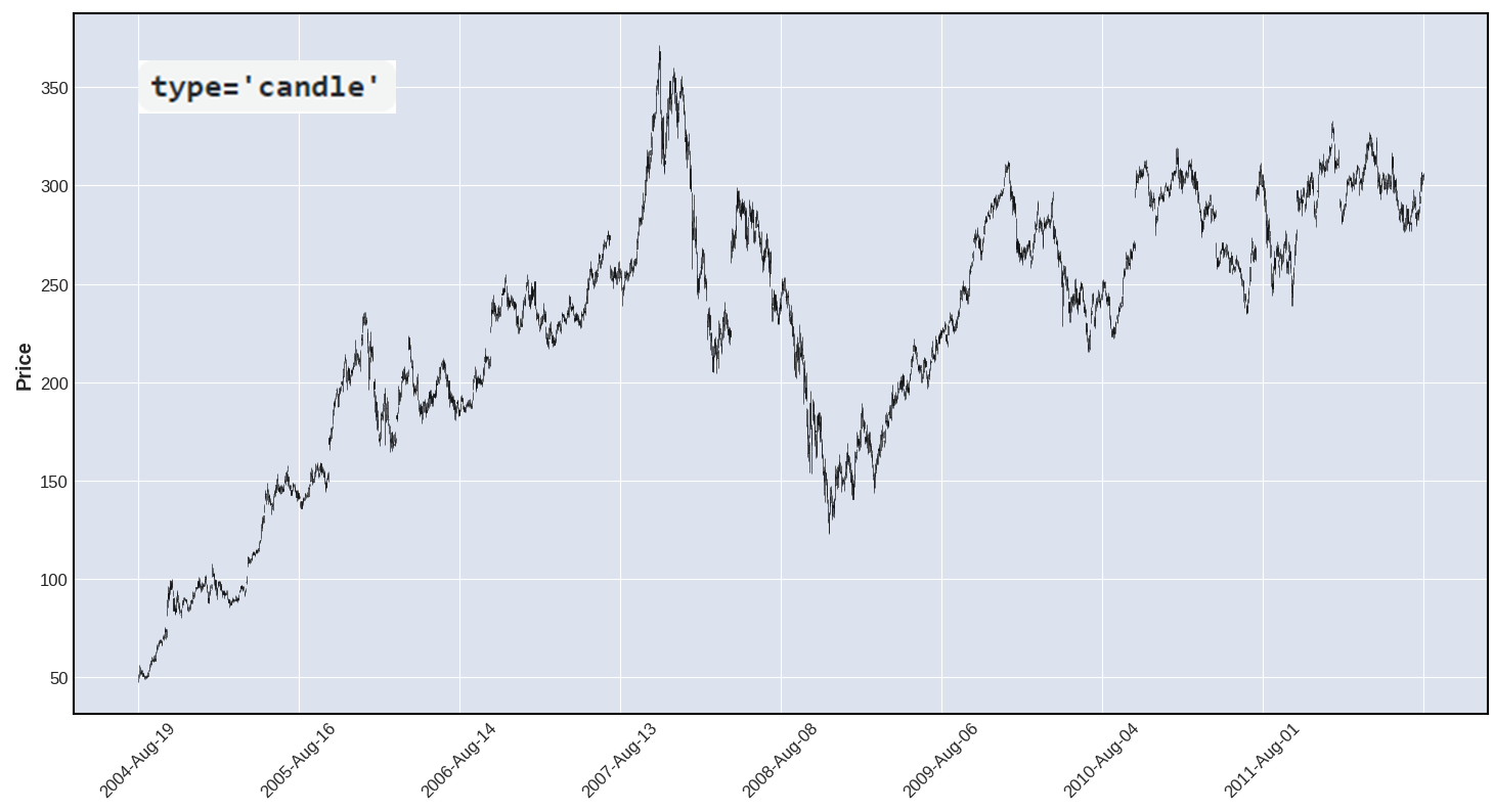
- Sometimes, without realizing it, users plot so much data that it becomes impossible to see the detailed shapes of candles or ohlc-bars.
- In such a case, it's easy to think that you have a line plot instead of candles, as shown below:

- How many is "Too Many" depends primarily on the size of your plot, and on the resolution of your monitor (or printer).
- The Above image shows 500 candles.
- Below is the exact same 500 candle plot made full screen on a 27 inch monitor with basic HD (1920 x 1080) resolution.
-
Notice that now, at full screen, you can somewhat make out the appearance of candles:
- (You may need to right-click and choose "Open image in new tab" to see the candle details.)

No. The limitations on being able to see candle detail for many candles at once, are due primarily to two things:
- Limitations of human eyesight.
- Limitations of computer monitors (and printers).
- Consider plotting intraday candles at 1 minute intervals, for one full week (5 trading days) at 6.5 hours each day: that's 1950 candles.
- A typical 27 inch (diagonal) computer monitor is 23.5 inches wide. Plot 1950 candles full screen, and assume a space of 1/5 of a candle between each candle (so they aren't touching each other). Each candle will be less than 0.26 millimeters.
- The smallest object the average human eye can see is about 0.1 millimeter at a distance of 18 inches from the object.
- You will see a 0.26mm candle, but you would be hard pressed to make out many details (such as distinguishing the wick from the candle itself).
- Also, the 1/5 candle-width space between each candle is actually too small to see; so the candles will appear to be touching.
- In practice, to be large enough to see on a 27 inch monitor, the space between 1950 candles should be more like 2/5 the width of a candle; this takes away some of the 23.5 inches from candles themselves, so each candle would then be only about 0.22 millimeters wide.
- Bottom line: You are not going to be able to see details on that many candles, unless you use a much larger monitor.
- If we use a 120 inch (diagonal) flat screen TV, with a width of 83 inches, then each candle will be about 0.9 millimeters wide.
- All of the above assumes your monitor has more than enough resolution to draw the candles. We will discuss monitors here, but the same principles apply to printers (except printer resolution is measured in dpi whereas monitors speak of pixels).
- A Full High Definition (FHD) monitor is 1920 x 1080 pixels. No matter how large the monitor is, there will be less than 1 pixel to display the width of a candle. Such a monitor simply cannot draw 1950 candles (no matter how large the monitor).
- 4K UHD (Ultra High Definition) is 3840 x 2160 pixels, giving 1.64 pixels per candle (if 1/5 candle space between each). Still not enough to draw 1950 candles.
- 8K UHD at 7680 x 4320 pixels gives 3.28 pixels per candle. Each candle will be 3 pixels wide, and the wick 1 pixel wide, no matter how big the screen.
for both vision and monitor/printer resolution, did not consider the space needed for the plot's axes frame, for the y-axis ticks, and for the price labels. Thus the above is a generous estimate; the actual candle sizes would be even smaller.
-
There are several things that can be done about plotting a large amount of data, and which one you choose depends partly on what your goals are. Here are some of the choices:
- use
type=line - interactive zoom
- plot less data
- resample data
Below we explore each of these four approaches:
- use
type='line' |
||
|---|---|---|
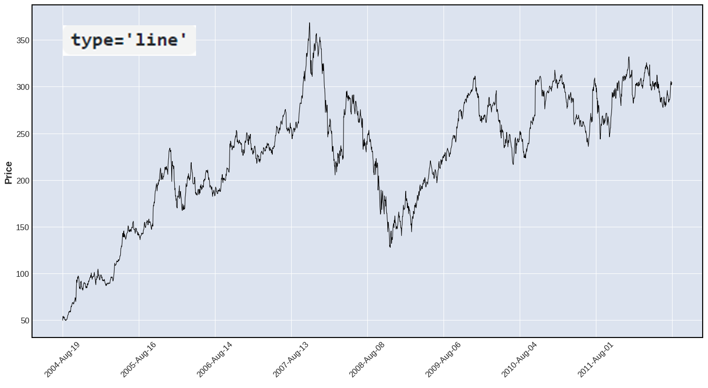
| If you really need to see the "big picture", for example a week or more of of intraday data, or more than 5 or 6 years of daily data, then consider making a line plot. You are not going to be able to see detailed candlestick patterns anyway, and a line plot gives a smoother, cleaner view of the price movement and trends. | ||
The Images Below show 2000 rows of ohlc data, first as type='candle' and then as type='line'. |
||
 |
||
 |
| Interactive Zoom | ||
|---|---|---|
| Many matplotlib backends include an interactive zoom feature. In the image below, this feature is indicated by the magnifying glass icon. Clicking this icon allows the user to draw a rectangle on the plot, to indicate which area of the image they want to zoom in on. Interactive Zoom gives you the ability to see the "big picture" and zoom in on various parts of the plot to example candle pattern details. | ||
 |
||
| This second image shows the result of the zooming in on a portion of the above plot. Now we can see clearly that the above plot really is made of candlesticks. The UI shows, in the upper right corner, the words "zoom rect" (for zoom rectangle) to indicate that zoom is currently in effect. The user can zoom in on another portion of the plot by first clicking either the Home button, or the Back button (upper left of the UI) to return to the non-zoom state, and then click the magnifying glass again and draw a different rectangle to zoom in on a different portion of the plot. It is also possible to zoom multiple times, gradually focusing in on a portion of the plot that may be interesting or important to you. | ||
 |
| Plot Less Data | ||
|---|---|---|
| If Interactive Zoom is not available, one can acheive the same result by plotting less data. This is easily done by slicing the data. The plot below, which is almost identical to the plot above, was made with the following code: |
||
 |
||
 |
-
At this point you can benefit by asking yourself: If I want to take a "big picture view" of my data (for example, 5 to 7 years worth of daily data, or 5 to 7 days worth of minute-by-minute data) do I really need my data intervals to be so small (days, or minutes)?
- If looking at 7 years of data, perhaps weekly candles are sufficient, or even better than daily candles.
- If looking at a week of intraday data, perhaps 5 minute canldes, or 10 minute candles, are sufficient or even better than one minute candles.
-
Pandas makes it easy to resample your data, for example:
- converting minute-by-minute data into data every 5 minutes, or 15 minutes, or every hour.
- or converting daily data into weekly data or monthly data.